
Monday, February 27, 2012


Friday, January 6, 2012

Portrait with Works Behind

This is one of our most recent projects, it's a high DPI picture of me layered over some of my projects. I think this came out particularly well.
Thursday, January 5, 2012
Tabloid Paper Project
This was the cover to my tabloid magazine. I think it came out wonderfully.

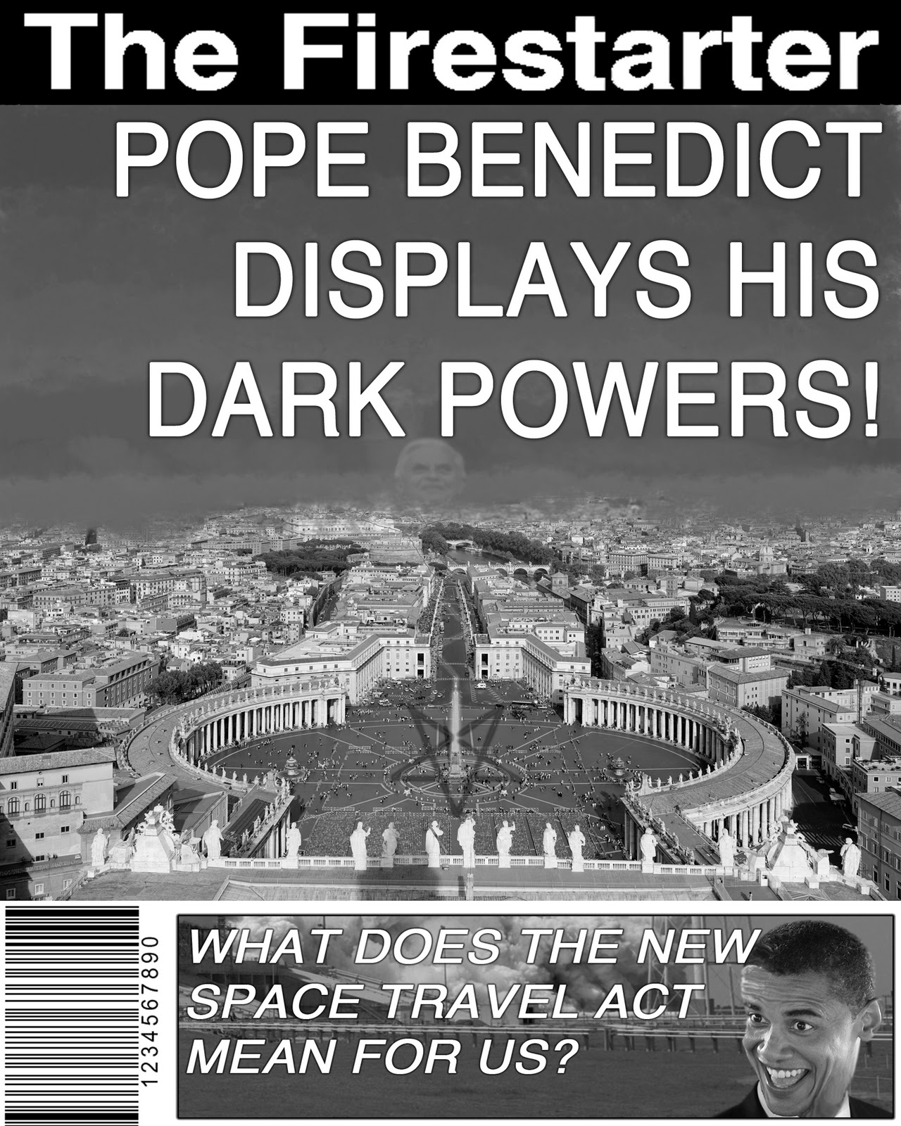
This was the image for my first article. This article detailed that the Pope was actually an evil wizard. I think this could've used some more refined flames, but I like it nonetheless.

The second article detailed how Obama supports a new space program that put the United States 34 quadrillion dollars in debt. I took Obama's face from one picture and put it on another for this one.

This picture was for an article about an alien disease causing people to have a bad sense of fashion. I blurred the image far too much.

This picture has hard to notice features, but they detail Earthly catastrophes. The article mentioned the end of the world.
The Two Magazines

This was our original assignment, to put our face on an already existing magazine. I chose to put my face over Steve Jobs' face on Time Magazine. I don't like how pixelated my face is, but it looks alright otherwise.

This was our custom magazine. I really like how it worked out, it's another one of my favorite projects. It was fun to do and it came out nicely.
Four Seasons

This was the first tree of our four seasons project. I like how I did the shading on this one.


This Winter tree was just a bit too simple for my tastes. I like the snow on the branches, the clouds, and the background; but the snow on the ground was just terrible.

I don't think my Spring tree was too bad, but I don't like how I shaded it considering the lack of leaves on it.
Things Coming Out of my Head

This project was supposed to embody the things you think about. The more important things are in the front and are larger. The less important things are smaller and closer to my head. There were supposed to be sixty things, but I didn't quite get to sixty, but I like how this picture came out.
The Tree

This was the first of five trees we made. The other four were part of a seasons project. I like how I made the clouds here, but everything else seems really bland and uninteresting.
Underwater Scene

This was a fun project in which we practiced making light shafts and custom brushes. I especially like my gigantic crazy fish. It originally had a tree in its mouth, but that didn't fit in particularly well.
Gumball Assignment

This was an assignment to practice making it look like we were using angled lighting. I really like how it came out, this is one of my favorite projects.
Black Cat

Three Pumpkins and Pumpkin Face

This was a pre-Halloween pumpkin assignment. We made ovals and put them together to create pumpkins. We also worked with gradients and different brushes for different effects.

This was my crazy pumpkin face that I made following the first pumpkin assignment.
Contour Continuation Designs

This was the first of two Contour Continuation designs. This one had relatively specific guidelines, with a bit of freedom. It's a bit too simple for my tastes.

This was the one I made myself. I don't like my gradient choice for the background.
Open House Posters

This was my first Open House Poster. This one was defined with specific guidelines and rules. I like how it turned out with the embossing and whatnot.

This was my second one. I think it turned out a bit too red. I don't think it's necessarily bad, but I don't like my color choices.
The Name with Words

This was another early project. It was our first time really getting to work with textures and text. I think it came out alright, but I would definitely change a lot about it now.
Six Distorted Faces

This project I ended up throwing together late, but I knew of more ways to distort my face. I experimented with the pinch tool, the line enhancing tool, the liquify tool, the swirl tool, and more. I like a few of these.
Alien Face

This was my first project in Graphic Design class. I'm not a big fan of how it came out because I was inexperienced at first. The border around myself is just sheer laziness. I like how my actual eyes came out, however.
Subscribe to:
Posts (Atom)